Creating great design takes guts
Daring to be different can give instant boost to market share
April 2008
 Mary Zalla
Managing Director
The word is out: Great design delivers great business advantage. Design is being increasingly leveraged to move and shape markets, attract customers, and help differentiate among competing products and services.

There is no doubt that consumers are more design savvy now than ever before. Interior design shows seem to outnumber game shows on television. American car manufacturers have been bested by their overseas design-oriented competitors, and La-Z-Boy has hired Todd Oldham to inject new life into a design-starved brand.
Yet despite its competitive advantages, very few companies and brands are truly leveraging the full, business-building power of breakthrough design. While there are many examples of aesthetically pleasing design, these designs usually follow the rules and meet category conventions. There are far fewer genuinely innovative designs. Design that is truly revolutionary and non-incremental, design that dares to be first, is in short supply.
Daring to dare
Consider packaging. Many brands artificially limit the power of package design to concepts such as color ownership, extractable branding units, or unique structures. While these elements can work together to deliver great design, in and of themselves they merely serve to differentiate the product at the point of consideration. They cannot be individually tied to trial, repurchase, and loyalty.
But great design can and does deliver these benefits. For example, Crest Vivid White is a superior toothpaste with breakthrough tooth-whitening capability. The package's vertical orientation, sans serif font, embossing, and clean side panel clearly define a cosmetic product, appealing to consumers who consider oral care part of their beauty regimen. But the design speaks just as loudly to consumers more focused on health care.
Although Crest Vivid White competes head-to-head with Colgate Simply White, a shopper would be hard-pressed to quickly identify Colgate Simply White based on its packaging as either a beauty or a health care product.
In the first three months following its launch, Crest Vivid White exceeded sales forecasts by nearly 300 percent, and Vivid White was the top-selling oral care item in Target stores during the first quarter of 2006. Just because no company had ever designed a cosmetic-looking oral care package didn't mean it should never be done. What has been done will only get you so far. Great design is about what can be done.
 Breakthrough packaging
Daring to be different is a courageous undertaking. After all, there is comfort in conformity and convention. When a brand's opportunity to make an impression on consumers is largely confined to packaging, there is a tendency to adhere even more closely to category conventions. Not only does this have a chilling effect on design, it also limits a brand's ability to deliver anything meaningful beyond category antes. Clarifying brand promise goes out the door, stripping away any basis for choosing or preferring one brand over another.
For example, Mama Capri, Coppola, and Paesana are three competing brands of premium pasta sauce. All the packages feature a photo or illustration of a young Italian woman with covered head. All the labels employ a sans serif font and white or yellow type against a mostly black background. All three have Italian-based brand names and nearly identical containers with gold lids. So even if shoppers were able to decide at the shelf which brand to buy, and had a positive experience using it, would they be able to replicate the brand purchase two to four weeks later? More likely they would find themselves in the pasta sauce aisle, staring at the three brands and trying to remember which one they had enjoyed.
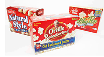
The same holds true for canned tuna. Is there an FDA regulation mandating that all canned tuna packaging be blue and white? Why is no brand offering a distinctive impression of itself against its competitors? Microwave popcorn is in a similar situation. Here is an ideal opportunity for one of these brands to better articulate its unique promise.

This pattern of conformity plays out in category after category. A true brand steward or student of design would consider this thinking counterproductive. Many brands find little opportunity beyond product packaging to communicate their promise to consumers. While this constraint may encourage insular thinking and resistance to bucking tradition, it also creates an opportunity to unleash the power of great design. Taking full advantage of design under such circumstances is rather like turning your car into a skid. It may go against every natural inclination and feel very uncomfortable at first, but after you've averted the crisis you know that it was the right thing to do.
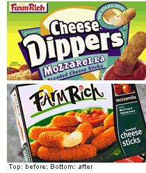
Here's another example of category convention trumping the opportunity to clarify brand promise and compel purchase. The frozen cheese stick category once had three major competitors - Ore-Ida, Anchor, and Farm Rich. Each brand claimed approximately a third of the market, ticking up or down a few points depending on who had fielded the latest pricing promotion. It was hard to tell them apart — as if the three competitors had a tacit agreement to look, act, and be the same at the shelf. All the packages featured cartoonish and childish fonts, oversaturated and unsophisticated colors, and whimsical, though hardly appetizing, illustrations of food or ingredients. Each seemed to say, "I am a juvenile product, overly focused on fun, for a strictly childish audience."
When T.G.I. Friday's (licensed by Anchor) entered the fray, market share for each of the three existing competitors started to fall. The Friday's brand offered the unique promise of "restaurant quality food in your home freezer" and did an admirable job of extending Friday's visual equities into the category. Farm Rich saw its share decline a full 17 percent.
Clearly, there was room in the category for a brand with family appeal - a brand that could lay claim to great taste as well as fun. Farm Rich decided to capture this position. It already regularly bested its competitors in taste tests, and could uniquely position itself as rich, satisfying, real food for the whole family. The business team realized that the previously marginalized Farm Rich brand name was capable of providing a robust platform for future growth, whereas the strictly food form based names such as Dippers, Poppers, and Bites are clearly and functionally limiting.
The Dippers brand was restaged as Farm Rich, using appealing photographs of real food to reinforce the message that its ingredients were authentic. Retail sales of Farm Rich cheese snacks rose 42 percent. The full Farm Rich line performed 27 percent better than forecast in the launch year. Great design and the courage to go against category convention rendered the Farm Rich promise more evident, connecting it to the product experience and making the brand more attractive to consumers.
 Brand coupons
While it's easy to see how good design works with sexy products such as toothpaste and cheese sticks, how does it fare in more mundane categories? Consider coupons. Few people would associate coupons with design. Even coupon zealots would say that the most important drivers of coupon clipping are coupon value and expiration date. But add the intoxicating power of great design, and people do respond.
Over 251 billion coupons are sent out to consumers each year. Most are distributed in Sunday papers as free standing coupon inserts (FSCIs). A majority of Procter & Gamble's North American brands regularly participate in multiple FSCI events each year. This improves scale efficiencies, optimizes coupon payout, and more closely ties the individual brands to their corporate parent.
P&G decided to create a multiple-brand coupon booklet. This well-designed custom publication, brandSAVER, not only engages consumers with relevant product messages and savings opportunities, but also establishes an emotional connection with its audience. The magazine ties color, design, and a real-life, contemporary photographic style to a particular theme or event.
P&G's brandSAVER has been and continues to be hugely successful, consistently delivering a 44 percent better return on investment than solo FSCI executions, and a single average brandSAVER event results in 26 percent more incremental product volume than an entire year of participation in other executions. Great design is also responsible for 9 percent more new-item trial, as well as 7 percent higher overall loyalty to P&G among brandSAVER users. If the brandSAVER team had been content with how coupons were designed and delivered in the past, brandSAVER would be a completely different publication with far less impressive results.
 The promise of design
It's surprising how many consumer goods categories are still competing along the same design assumptions. These categories are ripe for a brand to break the mold. The notion that great design appeals only to the discerning few is as outdated as dial-up Internet access. Just about everyone appreciates good design or is moved by it in some way. Recognizing this, smart marketers have made design an important part of the brand experience.
Design is one of the most effective and engaging ways to bring your brand promise to life, and the single most potent vehicle to move consumers from consideration to purchase. It can credibly and compellingly articulate the brand experience and initiate deeper and more rewarding interactions with consumers.
Great design asks what can be done rather than what has been done. The challenge to you and your organization is to learn from the past, while keeping in mind that great design is forward focused. Great design always asks "What if...?"
Hand it to Jack's
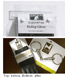
The family-owned Jack's Manufacturing, Inc., has been in business since 1971, making and distributing equine products sold by retailers, tack shops, and saddlery stores. Jack's products were once packaged in clear plastic bags with one-color stickers, an unsophisticated system that neither conveyed the quality of the products nor allowed them to command a premium price. Jack's wanted to increase sales and expand distribution beyond smaller retail shops to pet superstores and larger Western apparel and supply stores. A new, sophisticated identity and a simple but effective hangtag and card insert system allowed for intuitive product selection in diverse retail environments. Even without incremental marketing or advertising dollars, Jack's sales have risen 25 percent in the tack store segment, the largest channel. Jack's has also placed its entire equine leg care line with Tractor Supply, a giant farm and ranch store chain with 500 outlets.
© 2008 Landor Associates. All rights reserved.
This article was first published in
Package Design, (April 2008).