Beauty is in the eye of the beer-holder
Packaging is not confined to the no-nonsense wrapping of products these days; it can be a valuable tool to raise the brand's status, says Anthony Swart, CEO of The Brand Union, Africa.

While ten years ago, the average beer drinker might've smirked at the suggestion of a beer bottle - and even possibly the beer drinker themselves - being anything pretty or beautiful, far more attention is being paid to grooming the beer category these days as the worldwide trend towards premium becomes more mainstream.
Design doyennes like Philippe Starck have lent their talents and their design pencils to the alcoholic beverages industry, notably illustrated by Kronenbourg's 1664 who enlisted world-class designers to create a range of their limited-edition containers, aligning elegance and the aesthetic with everyday consumption.
The appreciation that packaging is no longer limited to practical wrapping but can be a tool to elevate the brand status - a concept long appreciated by the cosmetics industry - is steadily seeping into the beer category, innovating form and function.
As the world's most popular alcoholic beverage seeks to elevate its status, it's taking design lessons from cosmetics and perfumes, among other categories, which arguably defined the concept of premium with the focus on what makes consumers feel special, rewarded and individual. The premium niche used to be reserved for an elite few; now 'mass exclusivity' is what everyone wants.
And with the rise in premium brands in the beer category, there is increased focus on what it is that makes a brand stand out from its contemporaries and what will inspire and intrigue buyers. Recognising the 'power of premium,' the beer category is tapping into techniques and tricks from a number of other categories to change consumer behaviour and encourage 'shelf grab' and experimentation.
For example, beer brands are drawing inspiration from key competitor categories: wine and champagne. Like wine, beer is increasingly being appreciated for its complexities of flavour, ingredients, its origin and heritage, and its role in enhancing food flavours. Beer packaging designers are now moving in on wine’s traditional authority in the area of elegance, and champagne cues are informing design in thin, flute-like beer glasses. Some beers are also only sold in upper-end restaurants, rubbing shoulders with the Möets and the Veuve Cliquots on the wine list.
 Peroni
Elegantly slim, sophisticated and premium-pitched, Peroni has captured the imagination of the local market place with its Italian sophistication, attention to detail and style. It is the Ferrari of beer. While Peroni may not have pushed the boundaries of innovation, it's an excellent example of how packaging is a key contributor in its positioning in the 'premium' category. This Italian beer brand in the stable of SABMiller has successfully used a number of premium cues that support and extend into a well-executed communications campaign.
Since its acquisition of Birra Peroni, SABMiller's key focus has been on exploiting the full potential of the brand by launching it in key markets around the world, with the ambition of making it their largest international premium brand. Touted as Italian style in a bottle, Peroni captures 'the spirit of Italianness.' When it comes to self expression, effortless style and flair, arguably nobody does it better than the Italians. Italy is renowned as the style capital of the world and Peroni aspires to rank its brand alongside style icons Armani, Gucci, Prada and D&G. This foresight will allow the beer brand out-of-category line extension down the line.
The London office of leading brand consultancy The Brand Union was enlisted to overhaul the beer’s image and identity. A distinctive and compelling positioning was created for Peroni Nastro Azzurro to appeal to their core consumers, beginning with the unmistakably Italian character of the beer. New brand communication, promotion, point of purchase and - specifically - primary packaging design, were all reassessed to maximize the brand’s full potential.
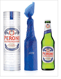
Historically, the look and feel of the primary pack and identity - a red brand signature on a white canvas and the classic blue ribbon (nastro azzurro in Italian) - was rich in Italian cues. The new design solution retains the timeless classic elements of the original label but gives them a fresh, contemporary feel, supporting the brand’s premium, prestige status. In addition, the classic green bottle was given a longer, sleeker neck for a cool and stylish look, its increased length elevating it above its contemporaries on the bar shelf.
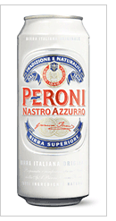
Peroni's considered packaging livery includes a fresh, clean white background canvas, red brand signature that is rich and striking, embossing on both the bottles and cans to extend the brand experience through the tactile, and the use of silver on an asymmetric neck helps signal refreshment.

And these days, the packaging of Peroni is likely to include a set of highly manicured nails wrapped around its slender neck as the growing number of women find favour with the stylish brand.
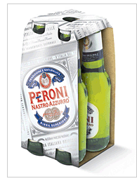
Previously overlooked, designers are now breathing new life into secondary packaging. As there is a trend towards at-home entertaining and the 'big night in,' designers have crafted convenient, carry-home devices that live comfortably in space-constrained fridges, and are an additional branding opportunity. Peroni has put together a three-pack that is specially designed to live in a fridge door compartment in recognition of the practical requirements of its consumers.
The new world-class packaging design works in tandem with a distinctive above-the-line communications campaign that plays a vital role in SABMiller's ambition to deliver the coolest beer brand in the world. Peroni pays homage to some of Italy's most stylish creations, notably executed in its advertisement campaigns that celebrate timeless Italian chic and la dolce vita.
Peroni's customers are comparatively demanding, therefore the brand will need to keep innovating and aware of what’s premium, a lesson other premium beer brands will need to pay heed to. But what is evident is that beer brands are increasingly using design and innovation, enabled by technological advances in material and packaging, to surprise and delight their ever-increasingly style-savvy consumer.